![](https://dangarchitects.wpengine.com/wp-content/uploads/2023/08/1S-21@2x.png)
![](https://dangarchitects.wpengine.com/wp-content/uploads/2023/08/1S-16@2x.png)
![](https://dangarchitects.wpengine.com/wp-content/uploads/2023/08/1S-17@2x.png)
![](https://dangarchitects.wpengine.com/wp-content/uploads/2023/08/1S-20@2x.png)
![](https://dangarchitects.wpengine.com/wp-content/uploads/2023/08/1S-19@2x.png)
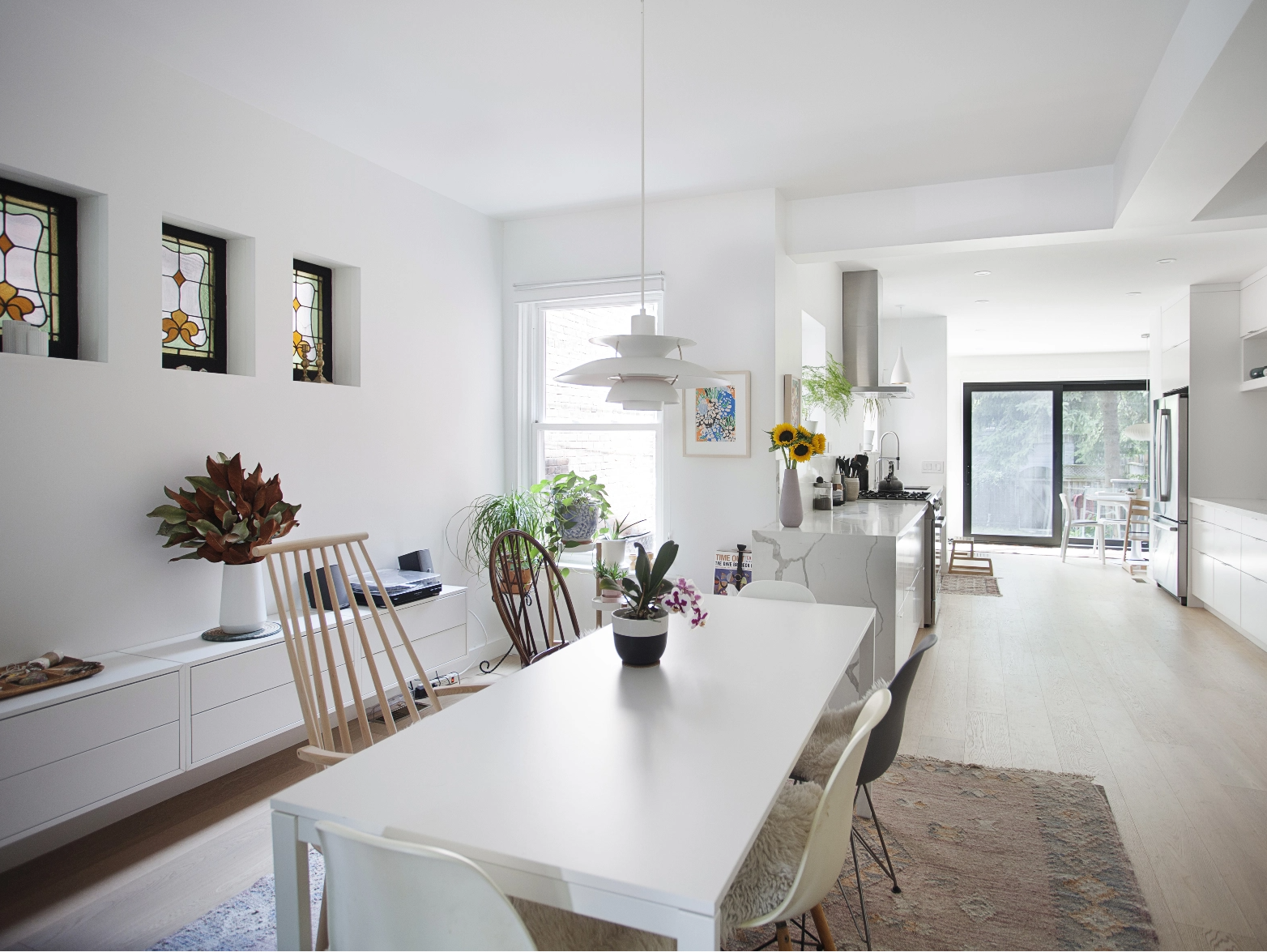
The approach was to design a bright and clean canvas for the clients to fill with their artwork, objects and life. Using a muted colour palate (whites, pastels, light wood) allows for detailed pockets of colour to pop: the stained-glass windows, plants, household objects, to the exuberant powder room.
![](https://dangarchitects.wpengine.com/wp-content/uploads/2023/08/1S-22@2x.png)
![](https://dangarchitects.wpengine.com/wp-content/uploads/2023/08/1S-24@2x.png)
![](https://dangarchitects.wpengine.com/wp-content/uploads/2023/08/1S-25@2x.png)